Has the AODAI typeface captured the elegant essence of its namesake?
Hanoi-based designer Nguyen The Manh is the mind behind many popular vintage-inspired typefaces in recent years. His creations are part of a larger movement by local illustrators, designers and artists to employ elements of Vietnamese culture into their works, be it the art style and stories of hát bội, ancient folk tales, or the capital’s Hang Trong paintings.
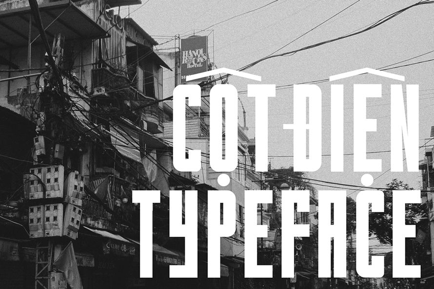
Saigoneer has previously written about three of Manh’s past works: Classique Saigon, Cotdien and L’Hanoienne. Even though there are subtle differences between the font families, they share a retro spirit, as evidenced in the use of broad strokes, bold curves and exaggerated diacritics. It goes without saying that they were much inspired by analog street signage from past eras in Vietnamese history.

Manh has built on that same train of thought and released a new typeface back in January this year named AODAI. The muse of the project is self-explanatory: the country’s national costume áo dài. In AODAI, vertical strokes are thick and emboldened to mark a “delicate backbone system of the anatomy,” according to the designer. He was also inspired by the high contrast of Didone typefaces, a modernist genre of fonts originated in the late 18th and 19th centuries, although AODAI is sans serif instead.
To distinguish between lowercase and uppercase, look at circular graphemes like O, C and G, which Manh decided to render with thin strokes in the lowercase versions.
Have a look at the complete alphabet below:


[Graphics by Nguyen The Manh on Behance]


