Vietnam’s sense of aesthetics is going through a retro revolution: from niche cafes playing nhạc vàng and an upcoming feature-length film on áo dài artisans to retrofitted album covers of today’s pop artistes, a crop of local creatives are finding inspiration for their products through vintage styles.
You’ve probably seen it around town, or at least in the local cybersphere: rotund characters and long strokes of diacritics on a background with faded film tones. Nguyen The Manh’s Classique Sai-gon typeface has gained “ubiquitous” status in Vietnam’s creative industry since it came out just last year, especially on almost any product carrying a vintage theme.

Classique has quickly garnered an avid following thanks to its universal appeal and nostalgic tinge. However, not many are aware that Manh is also the creative mind behind Cotdien, another vintage typeface that, like Classique, taps into the vein of 'Old Saigon' charm that has made the latter so famous.
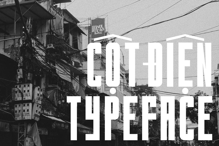
Cotdien is a stylized version of cột điện, meaning utility pole in Vietnamese, and it’s not difficult to figure out the meaning behind its name. The typeface makes extensive use of thick strokes on lanky characters that take up a lot of space in the layout, “just like a power pole that stands awkwardly on the street with a web of electrical wires,” Manh tells Saigoneer in an email.
He created Cotdien by simply applying the same ratio on the grid so that the letters look consistent. Then, to make it Vietnamese-friendly, diacritics are added using models from hand-drawn banners. This gives Cotdien a distinctive style, unlike Classique, which is largely a compilation of existing painted signs. The Hai Phong native also ensures that both Classique and Cotdien, available for free on his Behance profile, support special characters from 10 other languages as well.

Cotdien’s public reception has largely been positive, despite its modest popularity compared to its sibling’s star power. Manh believes that this has to do with the typeface’s support for Vietnamese since its launch and the improved consistency and kerning.
“I’ve seen many products using my fonts in real life, even in really bizarre situations,” the 21-year-old says. “There are many mixed emotions. Of course I know that their popularity is because people actually love them, but when I see them being used in inappropriate times or for the wrong purposes – like as normal fonts in long documents – I’m also a bit taken aback.”
The retro trend among Vietnamese creatives started a few years ago, but by now, it’s in full bloom: handbags, trendy coffee shops, phone cases, exhibitions, you name it; Manh’s typeface Classique is probably on it. For Vietnam’s batch of millennials, there’s a certain allure in seeing familiar features of one’s childhood on today’s creations.

Manh’s typefaces were also born of that sense of silvery nostalgia, taking elements from the last few decades of aesthetics and making them available to a modern audience via a convenient set of fonts that can be applied anywhere via the Adobe Creative Suite.
“This is purely my personal fascination with things that evoke a sense of wistfulness,” he shares with Saigoneer in Vietnamese. “It’s also a way to recycle old design materials and take inspiration from things that once were familiar – or are currently familiar to the point of being ‘iconic’.”
While Classique and Cotdien might have started as personal pet projects, Manh also hopes that he’s done something to contribute to Vietnam’s creative presence on an international level.
“I wish to use my design like a means to promote Vietnamese cultural values to the international design community,” the Hanoi-based designer said. “I think it’s been effective so far in parts – like making a Vietnamese mark on the international design map – a bit too ambitious, I know.”


